
UX Portfolio
This portfolio covers the skills that I have accumulated over the years as both an in-house professional and a consultant at experience design firms.
To access case studies, please request the password.
Experience Design
Crafting the most user-friendly experience for both visual (websites, applications, ...) and non-visual interfaces (ex: chat, phone, API).
Mapping Content & Experiences
-
Content and Migration Mapping
-
Journey Mapping
Information Architecture & Navigation Design
-
Tree Jack Testing
-
Moderated / Unmoderated
-
Remote / In-lab
-
Prototype / Live Site
UI and Interaction Design
-
Visualization & Ideation
-
Story boarding & Mocks
User Data Analysis
-
Stakeholder and Persona-building Interviews
-
Organic Visitor Metrics and Path Analysis
Design Thinking Workshops
-
Facilitation of co-design and Solutioning exercises
-
Proto-Persona Building
-
Pre/Post Mortem
-
Prioritization & Requirements Gathering
UX Research
Protototype Testing
Throughout my career, I've used different prototyping tools based on what is available from the client or consultancy; so I have enjoyed building with Axure, Sketch, and Figma to create mocks, wireframes and interactive prototypes of varying fidelity levels.
Live Site Testing
Allowing users to walk through the Tracker Boats and Bass Pro shopping experience on the live site and then walk through the same experience on competitors’s live sites creates a clear understanding of what truly delights and differentiates client experiences within your market.
Mobile Build Testing
We brought Edward Jones users into a lab to observe their natural behaviors and cognitive reaction to having the mobile application in their hands. This clarified differences between iOS and Android user behaviors and expectations of Material Design standards.
Card Sort
For various clients, including Medtronic and Story Supply Warehouse, we used this technique to understand how various personas organize information, which helped not only to define the navigation, but also to tailor personalization strategies.
Tree (aka Treejack) Testing
For Soft Surroundings the tree test illustrated the flaws in their navigation, and allowed me prove hypotheses about how/why their taxonomy caused confusion for customers.
Moderated
For the majority of my clients I have conducted moderated testing: Centene, Medtronic, Scottrade, Magellan Health and others. Walking the participant through the test scenario or interview in real time in a personal one-on-one meeting, which may be conducted in an office, lab or over video share virtual conference call. This allows for me to ask probing questions and build rapport for deeper insights into the participant's why behind their observed behavior.
Unmoderated
Often for surveys or navigation design testing, users are recorded self-directing their way through the study without interruption from me or other researchers; although we may be watching the session live. I employed User Zoom at Mayo Clinic for mobile experience testing and surveys also used Optimal Sort for Tree Testing and Card Sorts for various clients like Bright Horizons, Medtronic, Tractor Supply, and others.
Generative
For existing application management teams, I design test plans for moderated sessions that focus on how the users process the existing experience and call out their desires for new capabilities and features. For Mayo Clinic, Tracker Marine, Edward Jones and Bayer we compared the existing digital environments. Sometimes we compared against our competitors and sometimes against a desired future state, but we also ways listened and observed behaviors for opportunities to enhance and add new functionality.
Evaluative
For companies like Medtronic, Soft Surroundings, Maritz, Store Supply and Baptist Health I utilize tree tests, interviews, analytics tools and live site testing to set a baseline for how well the site performs and the users' attitudes and sentiment toward the current state.
Evaluative research is a great first step to engage in, so that you have a way to measure improvement either qualitatively or quantitatively.
Visualization
The large omnichannel client-facing portal redesign we needed to have multiple large teams in alignment on how work would flow through the continuous improvement continuous delivery (CI/CD) pipeline. In order to keep everyone informed and many parts of the process were converted into illustrations or diagrams and socialized.
To achieve this, I gathered knowledge from stakeholders, then worked closely with the agile lead to fine tune the deliverable. We introduced the illustration to the dev team for technical grooming, and then to enhance visual quality, I collaborated with a graphic designer who provided feedback and made minor refinements to improve aesthetic quality of the visualization.
The final product was one of many well received and repeatedly referenced visualizations that successfully facilitated asynchronous alignment across this massive project.

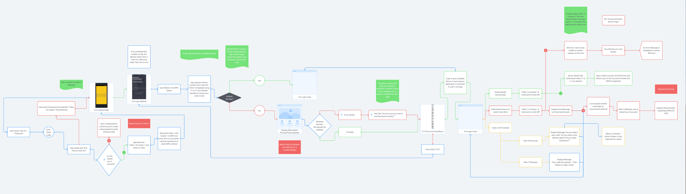
User Flows and Process Design
Creating visual representations of user flows and process flows often the most effective way to communicate and educate at any stage of a project.

Story Mapping
I used story mapping to align the all teams on the features and functionality needed for both the front and back end of the application. This formed the basis of our backlog at the beginning of the project. From this the entire team had a foundation for all other key administrative documentation such as the roadmap as we had a full view of what was expected to be included in the minimum viable product (MVP).
Wireframing and Prototyping
I have used various prototyping tools to create interactive experiences at different levels of fidelity. Prototypes are an excellent way to communicate with both stakeholders and developers in order to produce the best decisions.

Figma
Over the past few clients I've employed Figma to construct journey maps, mid-fidelity wireframes, as well as end-to-end interactive prototypes which were fairly high in fidelity. I'm proficient at using figma, creating nested, interactive components that I can share with my contemporaries to not only speed up my own work, but theirs as well.
Axure
I have created interactive prototypes that users can engage with in the mid to high fidelity range. They allow me to gather clear and concise requirements from stakeholders, observe the most natural user behavior when engaging with the product, and communicate most effectively with my developers.
Sketch
Using this tool to generate a series of screens allowed for in-depth design review with the client and stakeholders to produce a pixel perfect final design that would communicate visual requirements and stages of a flow to developers, which helped provide robust acceptance criteria for Jira stories. Sketch Cloud’s allowed for the easiest sharing of design details with developers and frustration free sharing of screens with stakeholders.
Invision
This tool allowed me to organize screen mock ups for easy navigation, walk stakeholders through flows asynchronously, facilitate solutioning workshops, and track approval status of expansive design undertakings.
Omnigraffle
This tool was used as the fastest way to visualize information architecture and basic structures for future page layouts.
Errors and Empty States
Designing Unahppy Paths
For this client project I was part of a redesign team, working to modernize the multi-platform global client experience.
I worked with the developers to fill in the gaps in the style guide, so that we could craft the best experience for when things go wrong.
Designing how things go wrong is extremely important. In this case we needed to understand what the page would look like when users experience an API failure, empty state, or when their numerical values exceed the character allowance illustrated in the originally designed mockups, or even when the user needs to be notified to take action.
I helped the client walk through the possible negative experiences that the user might encounter and designed the negative paths.
Web Accessibility
WCAG 2.2 AA Compliance for Responsive Web
Visually Impaired & Keyboard-Only QA Testing
I conducted moderated, live in person sessions with a visually impaired end user in addition to manually walking through the application with JAWs software. This allowed me to identify the experience issues and obstacles that a blind user would encounter that would not be picked up by an automated technology.
WCAG Checklist Evaluation
Comparing the digital environment against a WCAG 2.0 Compliance checklist helps identify the most common accessibility issues, and low-hanging fruit so that we may improve the quality of the disabled users’ experience engaging with the application, but this is not a comprehensive assessment.
Axe & WAVE Reporting
I used these browser extensions to identify any and all page elements that might possibly violate WCAG guidelines. This provides a good first pass over the site that catches more issues than a checklist evaluation, but still does not ensure the application is fully accessible for visually impaired users.
Color Contrast Analysis
Various tools allow me to check the contrast between hex codes in the style guide and existing screen mockups to ensure that he minimum contrast is achieved for AA Compliance to WCAG standards. If contrast is not acceptable, then I would recommend the nearest acceptable hex code as an alternative to replace the color throughout.
I also checked the mock-ups of charts and graphs in the application for 9 color blindness variations. I then chose the best combination and display order. This fulfilled a need to expand the existing color pallet for the cloud-based application.